
Field Recordings.
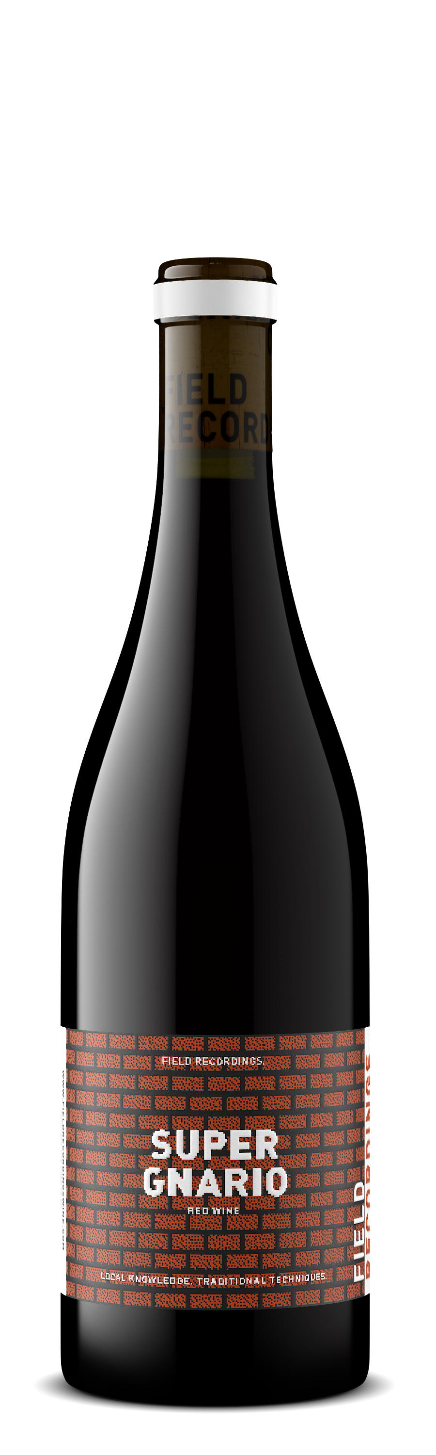
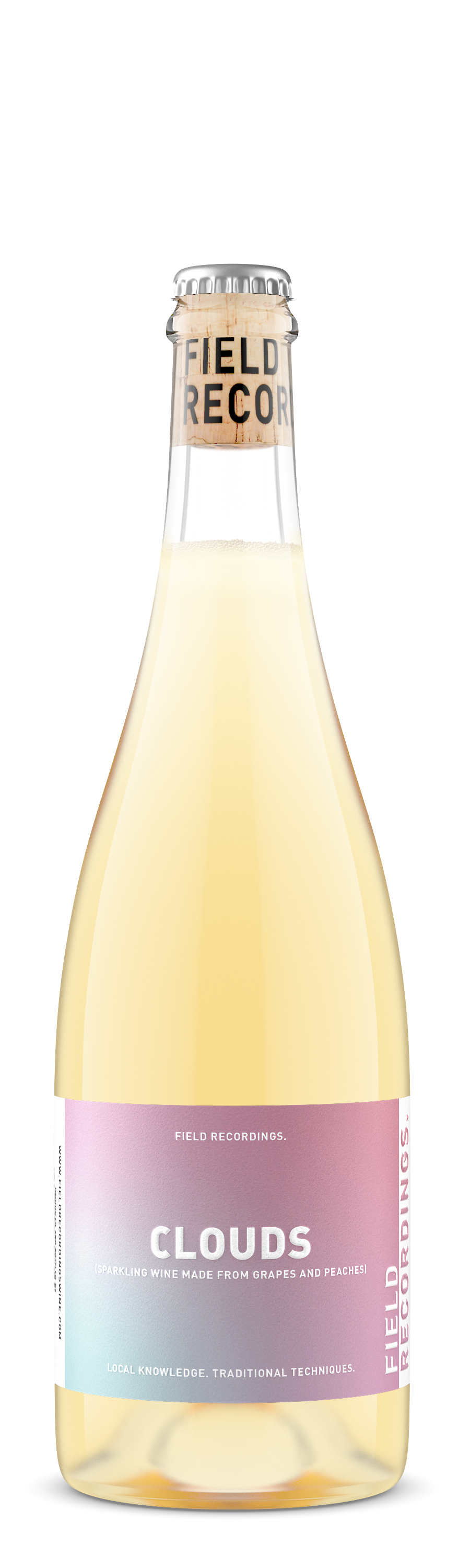
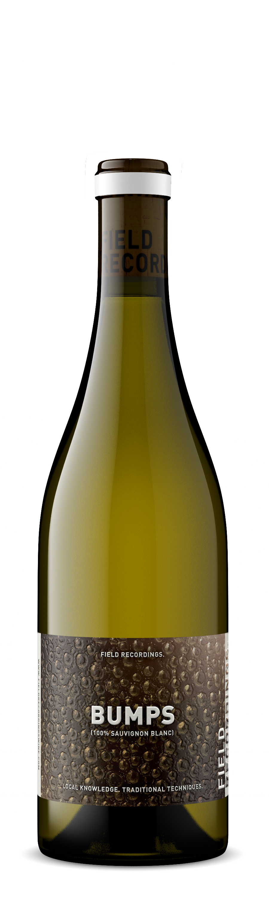
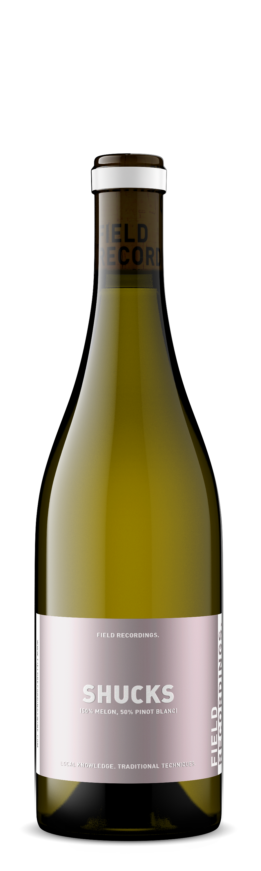
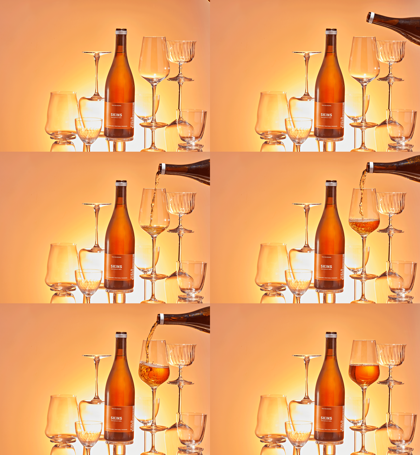
Bold yet simple, these labels were designed for easy brand recognition. So recognizable, in fact, that some eagle-eyed fans noticed the labels in the background of a Netflix show.
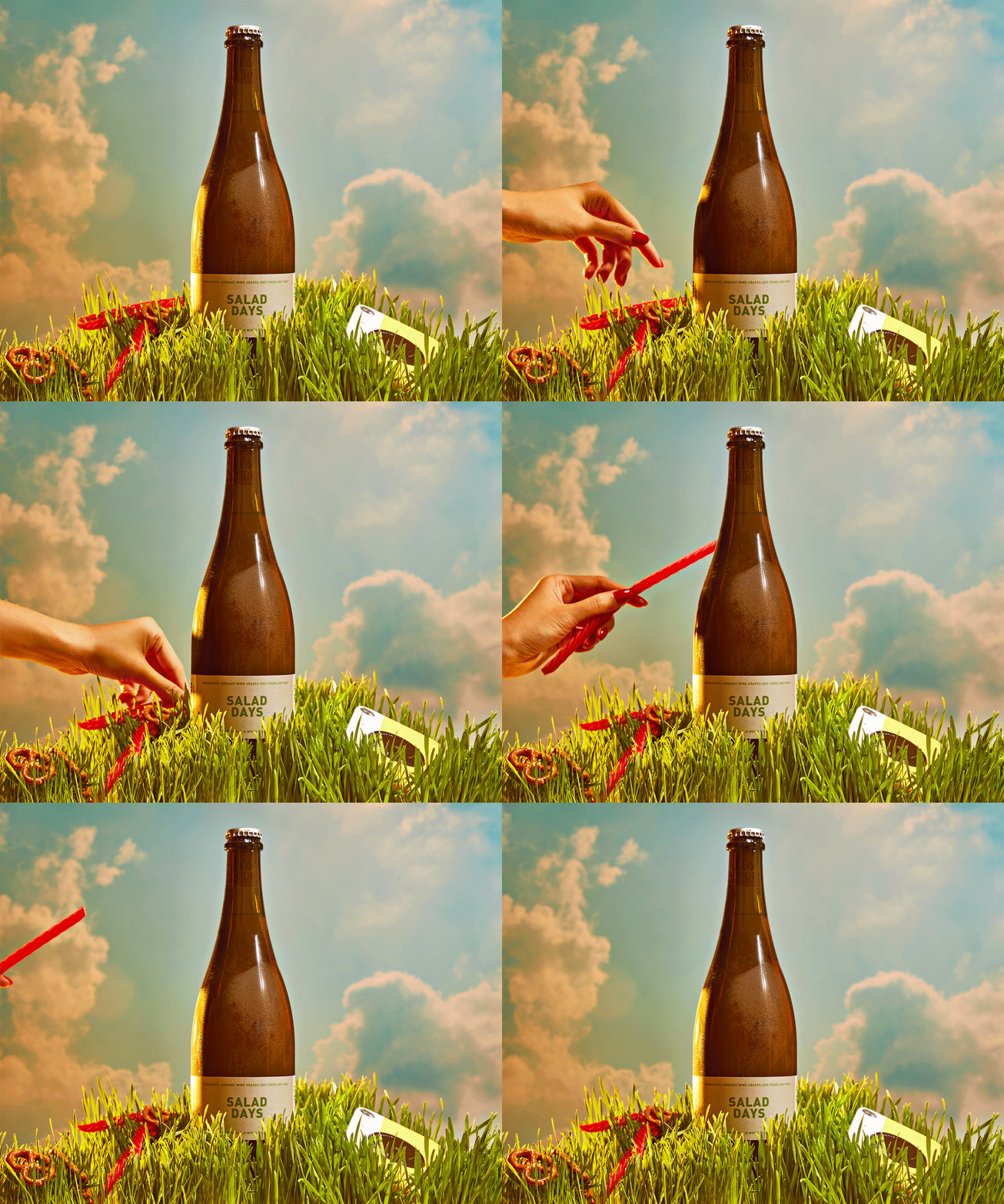
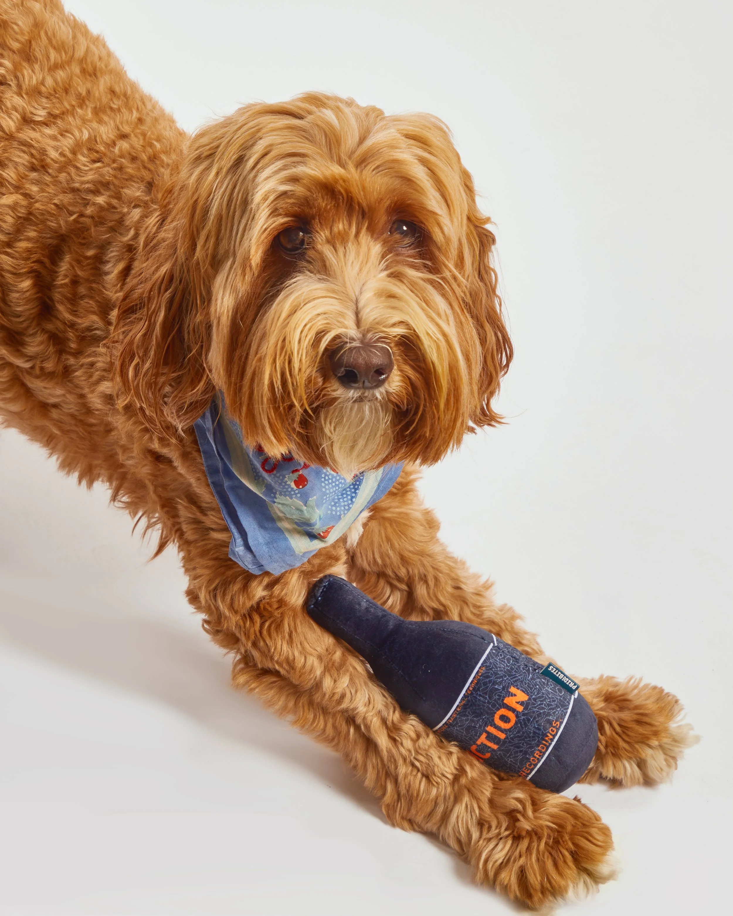
PHOTOS BY TRACIE DAVIS
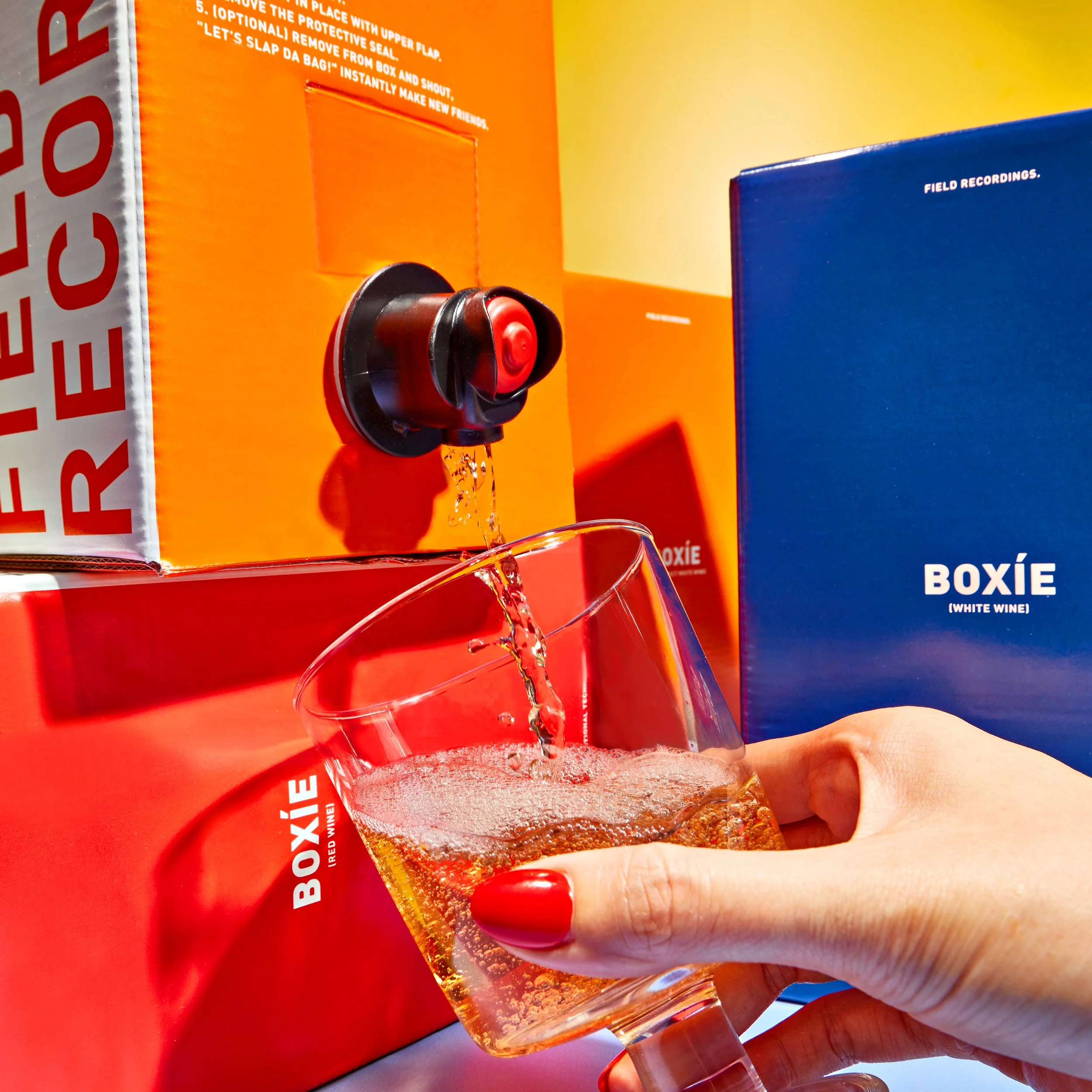
Known as one of the most fun and progressive brands on the Central Coast, we needed a design to convey a minimal-intervention, “no frills” wine style, while adding subtle easter eggs, unique printing, and varied substrates to keep consumers curious for more.
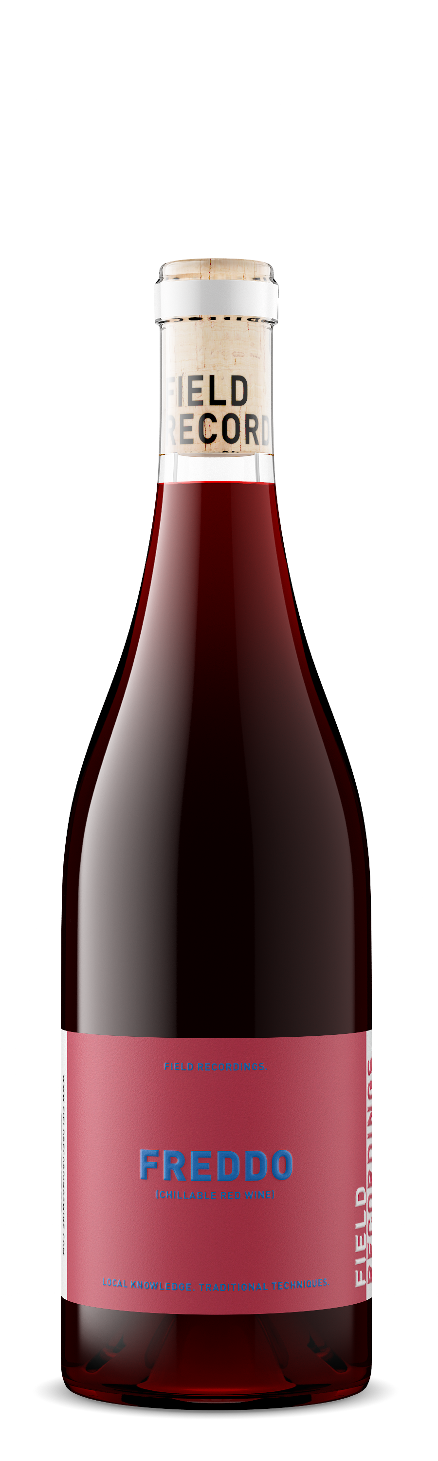
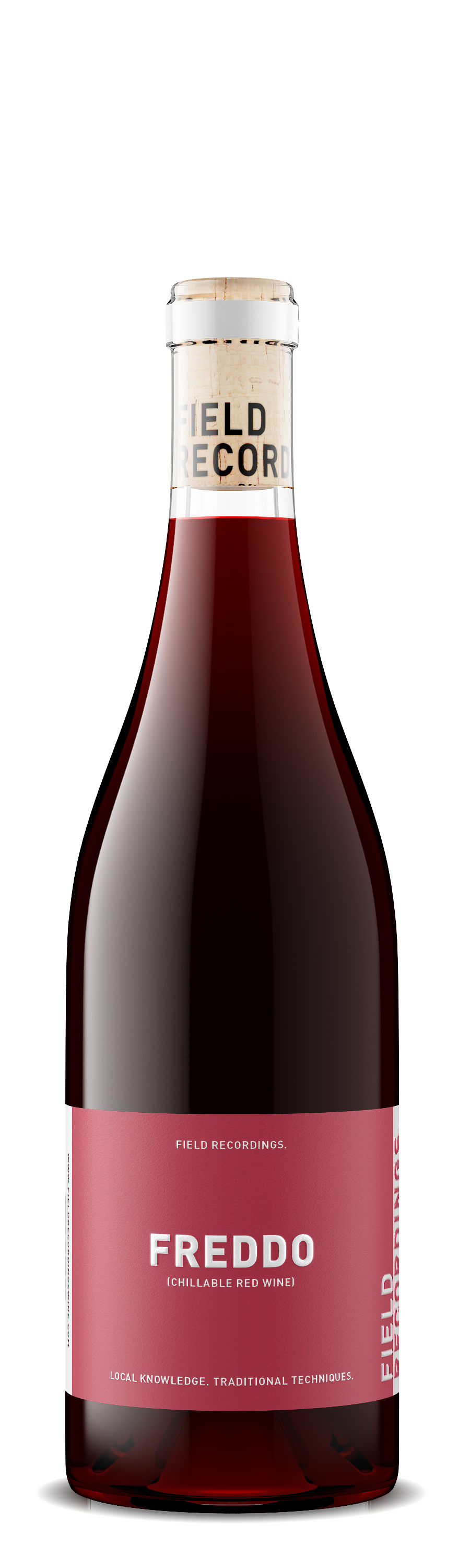
“When the text turns blue, you know what to do.”
Chilled red wine can be a new concept to some. We used a thermochromic ink that changes color as it chills to encourage consumers to throw it in the fridge. Once it’s blue, it’s ready to drink!